Paint Colours Of The Moment
When it comes to paint colours we really are spoilt for choice these days. Not only is there a vast array of colours on offer but they come in a wide choice of finishes* too. Here we explore colours that we can’t be without right now. You’re in for a treat this week - this post contains the greatest number of mood images currently on our studio wall!
As a UK based studio, we’ll be mainly referencing UK suppliers, but we have sneaked in a couple of our favourite companies from the States to make sure our friends across the pond don’t feel left out! If there’s a colour that you love in this post that is not available in your country, then check out these sites which help you find matches colour matches between brands:
My Perfect Colour has lots of USA brands and Encycolorpedia has the largest comparison we’ve come across of not just brands but includes HEX and HTML conversions too.
*Note: Most of the time we go for the wall in a matt finish, woodwork in a satin finish, and ceilings in a flat finish throughout.
These are the colours we can’t be without right now.
_______
PANTONE
As we said before in our How to Create the Ideal Three-Color Palette post, we’re not huge fans of big statement colours when it comes to most interiors. Contrary to this we love Pantone’s colour of the year 2020. Announced last December, ‘Classic Blue’ is a bold and dynamic shade proving popular in interior schemes all over Pinterest.
19-4052 Classic Blue
“Instilling calm, confidence, and connection, this enduring blue hue highlights our desire for a dependable and stable foundation on which to build as we cross the threshold into a new era.”
Farrow and Ball
An absolute must colour palette. Farrow and Ball have, in our opinion, an unparalleld skill when it comes to picking colours. Their palette is not extensive so we really value their editing. On the whole, pick a Farrow and Ball colour and you’ll be on to a winner - thats an unbiased, unsponsored opinion too!
It is hard to narrow down to just a few of their colours, so we’ve picked colours that we’re excited about right now. Here goes…
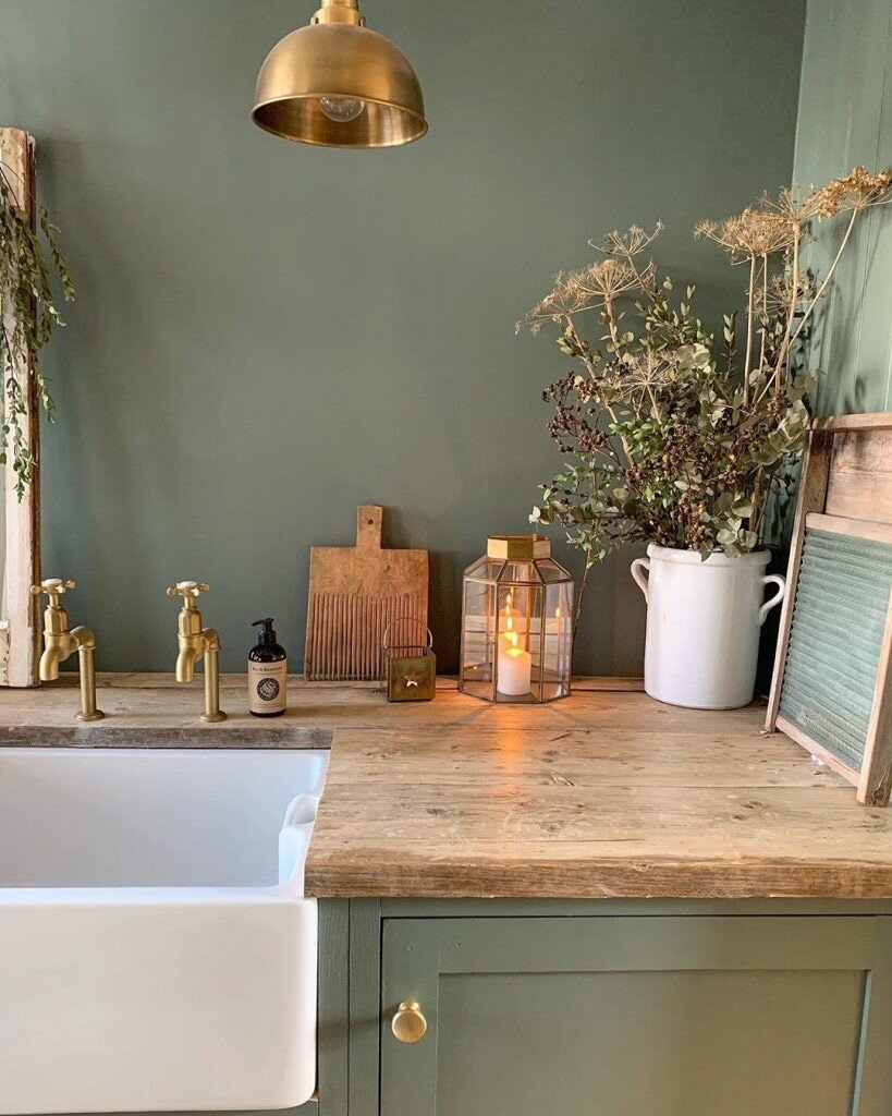
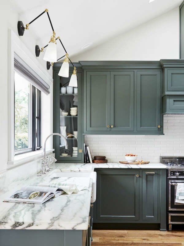
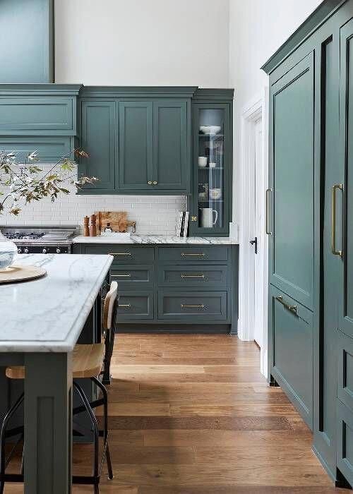
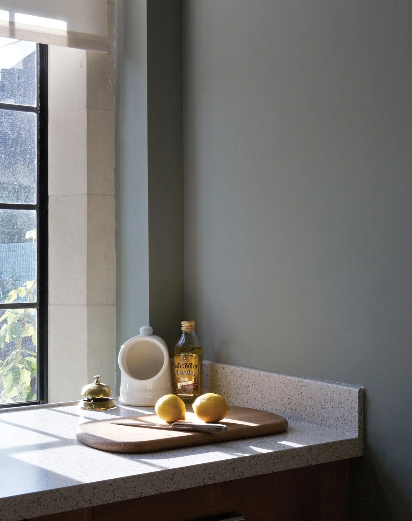
Green Smoke
A Moody Green Like No Other
This moody green feels classic and of the moment at the same time - a popular interior colour during the late 19th century. It has an irresistibly inviting deepness and weathered familiarity while evoking calm and serenity.
______
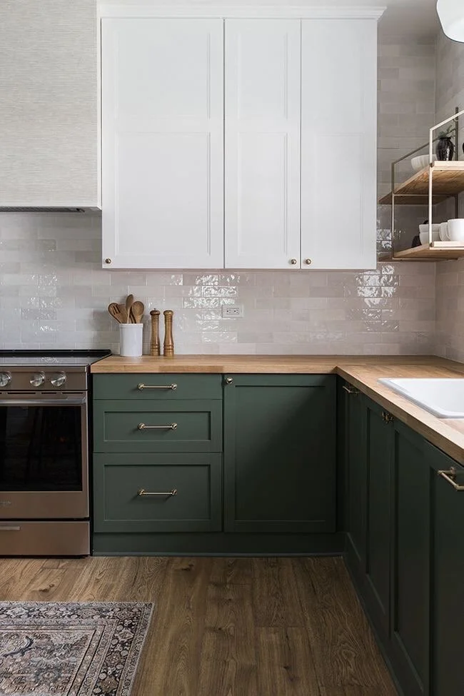
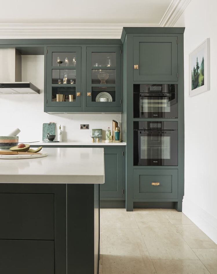
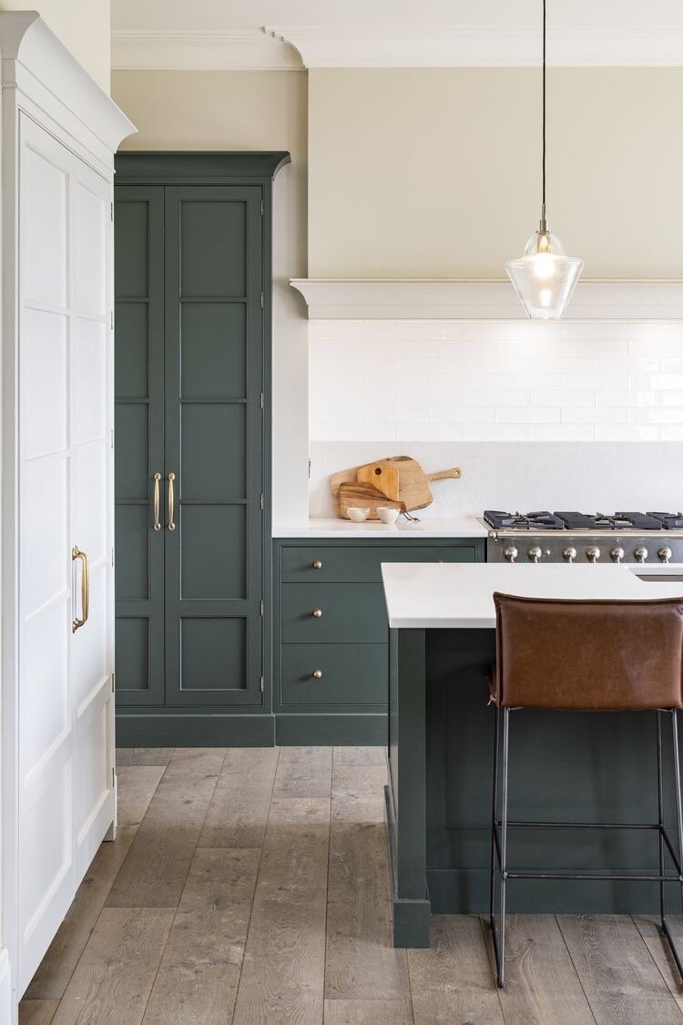
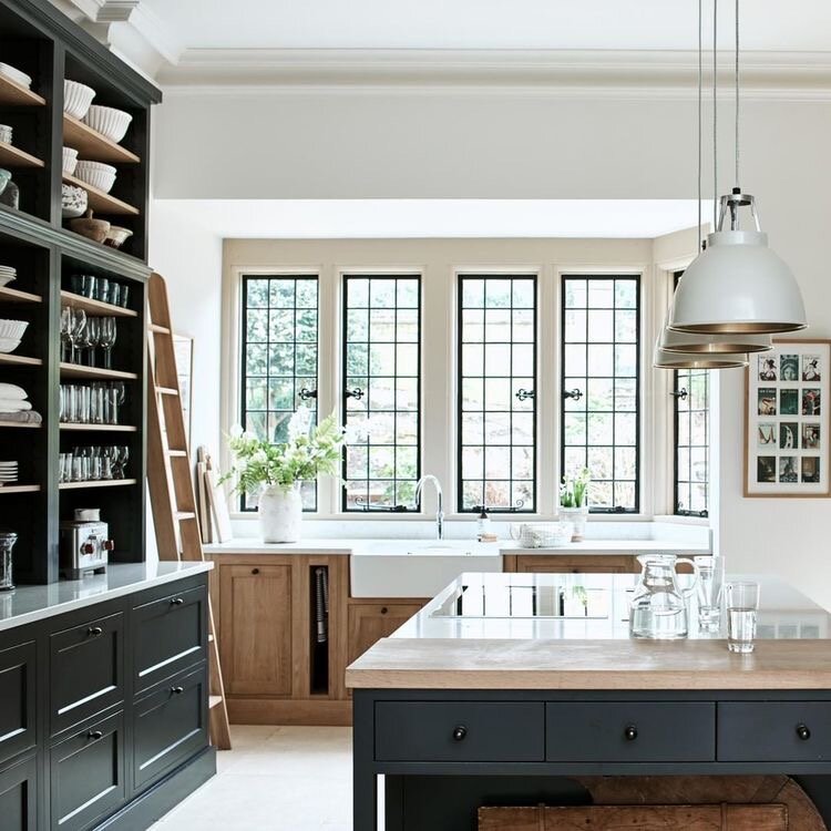
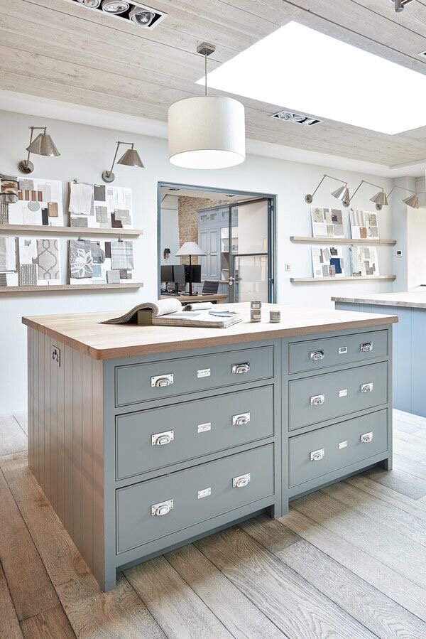
This colour is so in right now it’s unreal. We’re seeing in used in kitchens and it’s blowing our minds - seemlessly bridging tradition and somehow making the classic shaker style kitchen feel contemporary.
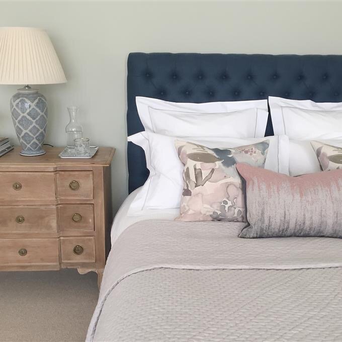
Below is just a small selection of some of our latest dream house pins featuring this standout colour. Beck will be using it in her guest bedroom but is also considering it for the kitchen - watch this space!
_______
Wow that green and marble though….
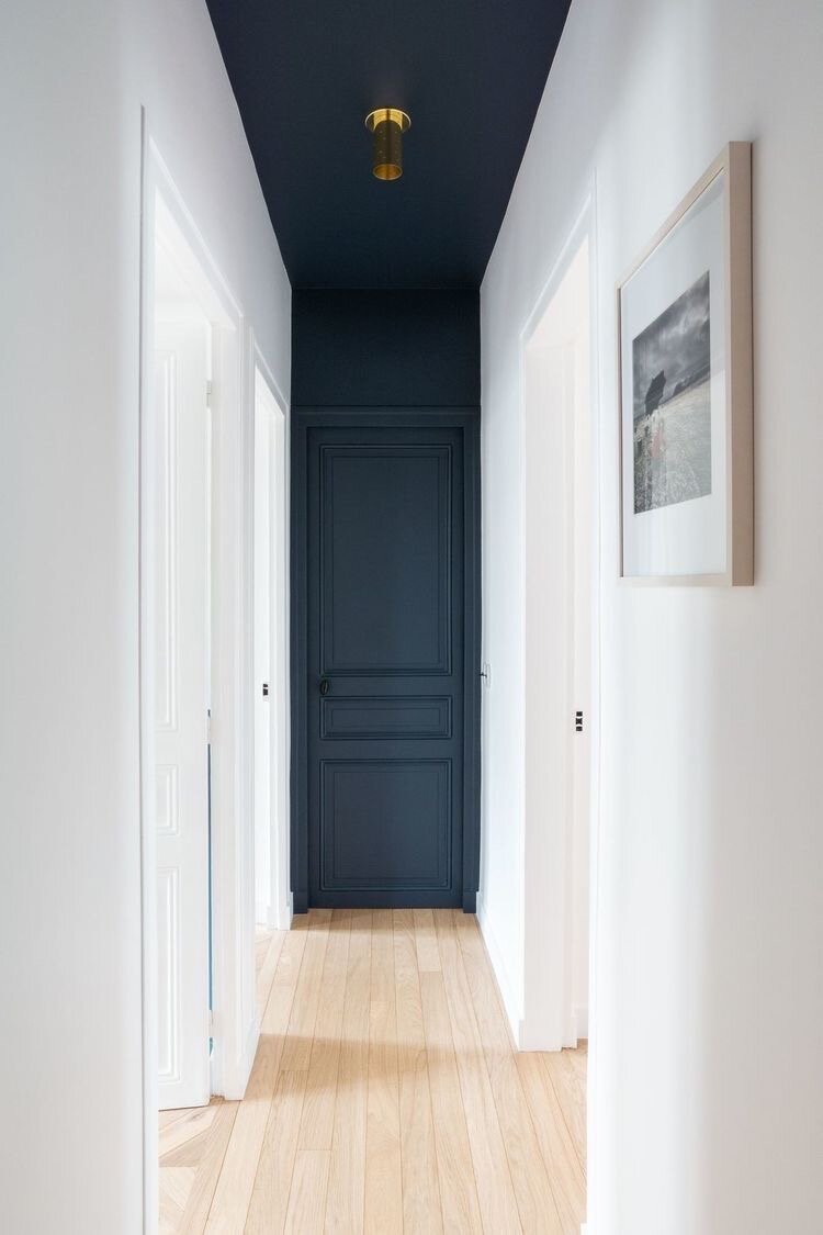
Hague Blue
A True Deep Blue
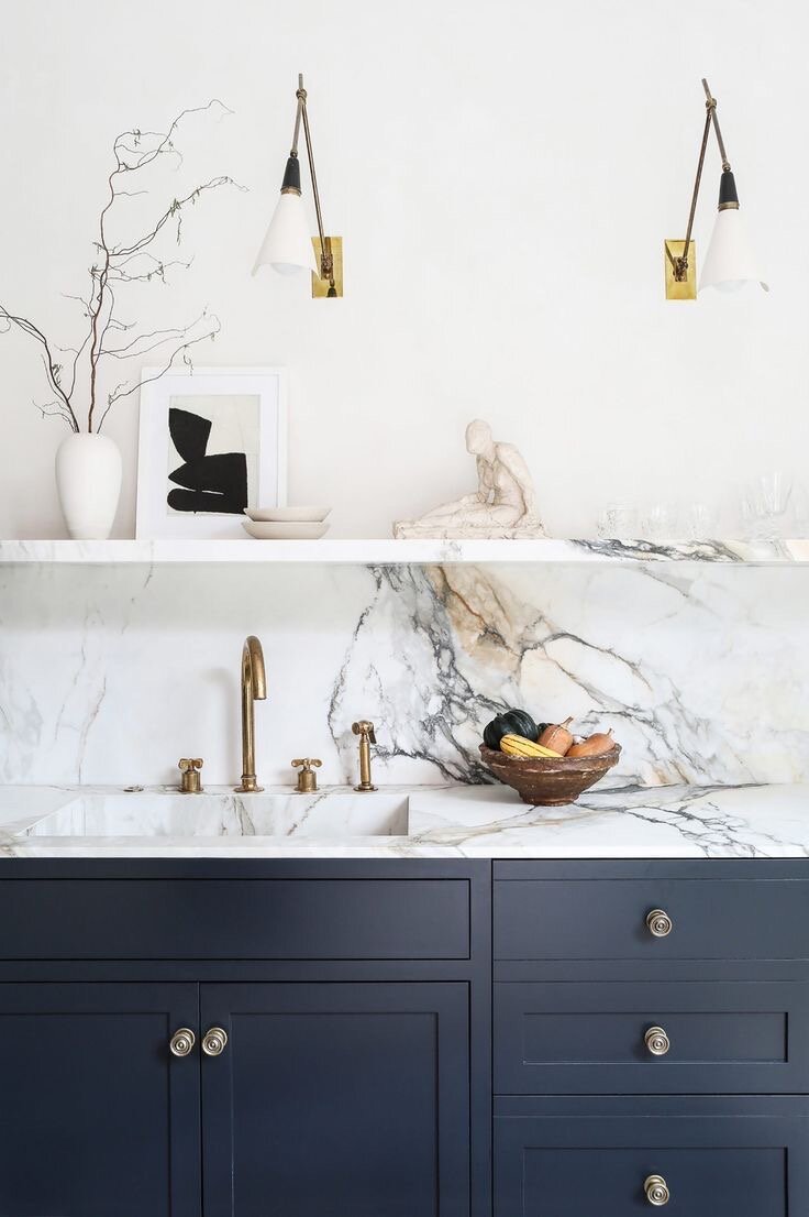
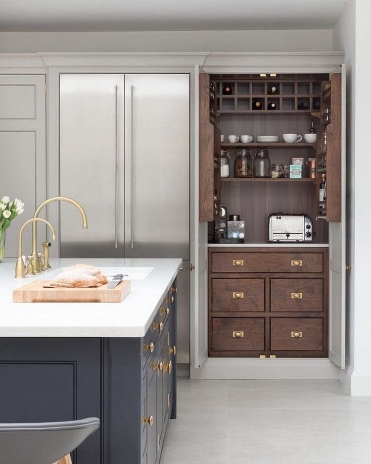
This blue is inky and deep. We love this colour in kitchens as well but also used to add contrast, such as doorways as the image above demonstrates beautifully.
This strong blue takes its name from the fantastically coloured woodwork much used by the Dutch, and still works wonderfully to ground skirtings or as an accent colour on the walls when teamed with Borrowed Light. The green undertones of this timeless, deep and dramatic blue means it sits as happily outside as it does in small dark rooms.
______
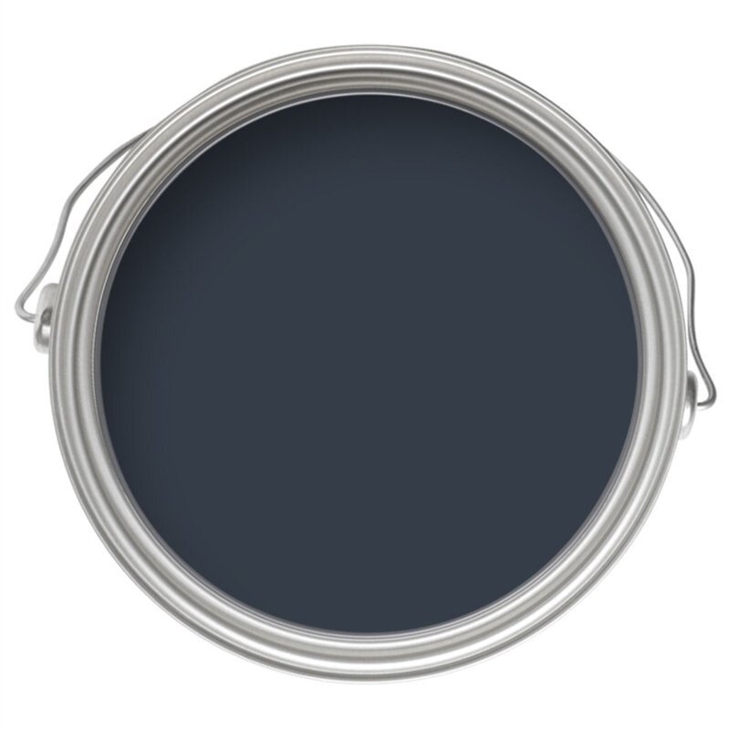
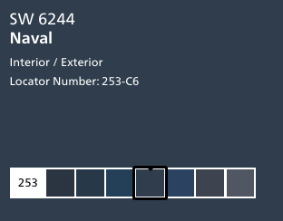
If you love this colour but can’t get farrow and ball fear not! Sherwin Williams has a very similar shade and it just happens to be their colour for 2020: SW 6244 Naval
Naval is a deep twist on a classic navy blue, and it was chosen in part for its references to the sea and the night sky. According to Sue Wadden, Sherwin-Williams' director of colour marketing, the shade is:
“Simultaneously luxurious and versatile, and would enhance a formal dining room as much as a zen yoga studio”
Shaded White
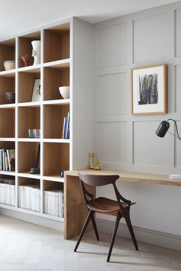
Our favourite neutral from Farrow and Ball’s range. A perfect greige, no too warm, not too cool it really is perfection.
A Grounded Greige
Used on this vaulted ceiling shaded white adds depth to the space and a wonderful contrast to the almost white walls. If the ceiling had been white as they are in 99% of homes, the room would have felt washed out and possibly cold. Through adding the tonal contast the space feels much more grounded and cosy without becoming dark or oppresive.
_______
This neutral takes its name from the soft tone created when many of F&B’s whites are used in deep shade. Shaded White has a gentle greyness, but with none of the cooler tones of Cornforth White, making it incredibly versatile within homes both old and new. It is often used alongside lighter shades such as Pointing or Slipper Satin for a restful space or paired with Drop Cloth for a wonderfully relaxed feel.
It’s almost impossible to pair it with something that doesn’t work!
______
pairing with earth tones
We prefer using earthy tones in materials and fabrics rather than paints. Here the warm of the brick’s clay colour and surface texture work perfectly with the distressed painted bricks.
We have it on good authority that Benjamin Moore has off white’s to die for. If you’re after this look then why not try:
Swiss Coffee OC-45
This colour is part of the Off-White Colour collection by Benjamin Moore. Inherently sophisticated and endlessly versatile, the Off-White collection offers subtle nuances of whites that suit tranquil, serene environments as well as creates colour-enhancing accents for dynamic spaces. A compilation of 152 white and off-white colours.
______
Sherwin William’s colour of the year 2016 and for good reason. Still looking great a few years on it’s a must-have in a neutral palette. Alabaster offers a sense of personal solace and revival to weary minds.
______
pigeon
The last one from Farrow and Ball - okay almost last one, as we can’t talk about Pigeon without Mizzle. A tonal pairing with so much synergy, this is currently on Beck’s kitchen walls and works beautifully with her upholstered bench (photos coming soon). Of all the colours we can see, humans can distinguish the most variation of tones of the colour green. This could be why we’ve featured more greens in this post than other colours.
A Versatile Blue-Grey
A darker shade, it lends itself to use outdoors with the high light levels.
If you want to re-create that Cotswolds green for your front door, you won't go wrong with Pigeon!
This cosy and nostalgic blue grey is named after the colour of the bird often sighted around the London landscape. When paired with Mizzle play with shadows, depth and softness abound creating a relaxing atmosphere, reminiscent of nature. Beck’s first choice for her future studio in the dream home build, here’s a sneak peek of her current mood images.
______
Dulux
The market leader in the UK, Dulux is a household name up and down the land. Not always a favourite with designers as they really do all colours, their paint quality is not bad, and sometimes preferred by decorators as it has more ‘play’. This means it’s more forgiving and has better coverage than some of the more classic paint companies that use natural pigments and dyes.
In an attempt to make up some ground this year, Dulux chose a left of field (for them) colour which took us by surprise.
Tranquil Dawn
A Calming Light Green
A colour inspired by the morning sky, to help give homes the human touch. This versatile shade of green can be used to create spaces for care or for play, to find meaning or for creativity.
Grey Owl
Benjamin Moore’s Grey Owl is a pretty close match. Here used on panelling with a contrasting wallpaper above. This room has a feminine feel without being too ‘girly’. Perfect for guests and older children alike.
______


